Step-by-Step Guide to Creating Interactive Power BI Reports
When your system is ready to create powerful and interactive Power BI reports, you need to learn the basic tactics to create intuitive visual reports and the early preparation required. Since Power BI is designed in such a way that everyone handy with MS Excel can seamlessly and effortlessly generate Power BI reports.
In our other blog, we have learned ‘How to clean and transform unstructured data in Power BI’? In this blog, we will understand how to create, publish, and share interactive reports in Power BI.
Before we move ahead, let’s have a brief overview of Power BI Reports:

What are Power BI Reports?
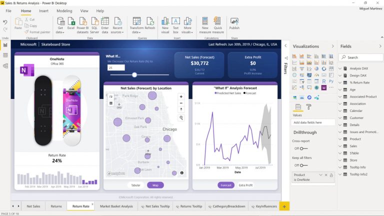
Microsoft Power BI is a business intelligence tool to create stunning reports, powerful visualisation, key analytics to support people in the organisation while making decisions.
Power BI offers endless customisation opportunities to create highly interactive and engaging reports.
 source: microsoft.com
Users can make seamless use of standard visualisation or can create their custom visuals too. Further, these visualisations can be shared with the people within your organisation.
One can also download the reporting visuals to satisfy their customised reporting needs. These downloadable visuals could be either paid or free.
Read also: “What is Power BI ? – A Complete Introduction“
Benefits of Power BI Reports
Power BI Reports are transformed way of data into a dataset that helps to get multiple visual insights. A single report can comprise a single visual as well as pages with several visuals.
These visual reports can be created to know the actual happenings in your organisation. Reports can be seen using a seamless personalised dashboard.
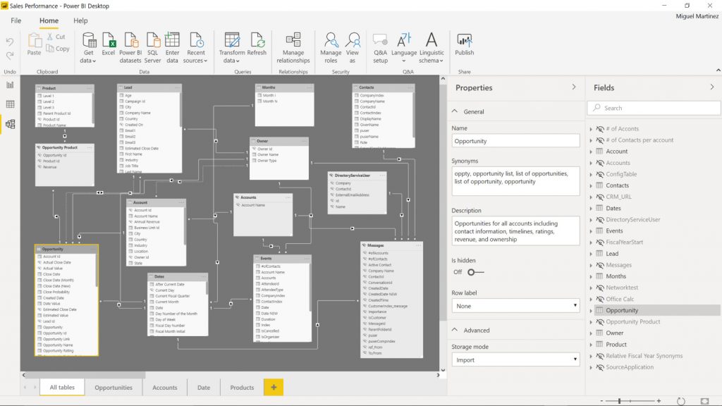
These reports can be created using Power BI desktop and can be leveraged depending on the type of Power BI implementation you acquired. It could be either on-cloud (public or private) or on-premise, hence, your reports will be represented accordingly.
 Source: microsoft.com
As organisations could comprise different departments and may require different reports to satisfy their department-wise requirements. So, let’s understand how it works with Power BI – a Power Platform.
Department Wise Reports & Visualisation in Power BI
Leveraging Power BI, you can generate department-wise reports too. This will help businesses to analyse the processes in each department and can make department-wise decisions.
All can be done by creating a workspace for every department and related reports can be stored accordingly.
For instance, you need to track data for the Sales department. Here, you need to create a Workspace for ‘Sales Department’. Now, any related reports & visuals that you create can be stored in this workspace and can be shared further too.
Users with whom you shared these reporting visuals can access and utilise them from their own Power BI dashboard. As a result, everyone can make a productive decision based on shared reporting analytics and key visualisations.
How to Generate Interactive Reports in Power BI?
Creating reports in Power BI sounds like creating an Excel Sheet. Power BI could be more effortless to those users who are well-versed with advanced MS Excel features and data navigation.
Rest, basic training on generating power BI reports can help users to start creating powerful reports.
Now, let’s unwrap the step-by-step process to be adopted while creating reports in Power BI:
Step:1
As you could have various data sources across your organisation. All you need to import your data into your Power BI platform. Here, you need to adopt some data cleaning and data structuring techniques.
To know how to perform Data cleaning and sanitisation to make uninterrupted reports and to get an actual data analysis, request a free Power BI demo.
Step:2
Once you get success in importing the cleaned and sanitised data, the next step is to create Power BI reports by choosing the visual pattern out of the available charts, bars, and considering the other details that make your visualisation as personalised as the way you want. You can integrate your data sets to make custom reports and visual analytics.
Step:3
Once your Power BI reporting designs and visuals are ready, you can publish the prepared visual reports and can share the same so as anyone in your organisation can analyse the data as per their need and can make decisions accordingly and instantly.
The Bottom Lines
Power BI is a Power platform by Microsoft that helps to drive business intelligence in your organisation with actionable data and visual reports. Anyone with these reports can make instant and early decisions to drive efficiency and growth.
Hope this blog will answer your questions and help you to make interactive reports to support your business pillars now and in the future.
To know more on how Power BI Reporting visuals can be created or to avail of user training, Contact Dynamics Square today, our experts can help.
.png)